

Security SA required a distinctive identity for its VIP Division, which provides executive protection, luxury transport and other premium services. The objective was to position the division as an exclusive offering while retaining a clear visual connection to the established Security SA brand.
We updated the primary Security SA logo, preserving its recognisable red swoosh, and developed a dedicated silver emblem for the VIP Division. The identity was then introduced through a promotional video and an extensive range of marketing collateral across digital, print, display and branded applications.
The primary challenge was to distinguish the VIP Division from Security SA’s broader service offering without creating an identity that felt disconnected from the parent brand.
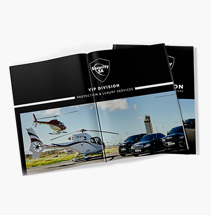
The visual direction needed to communicate security, discretion, professionalism and exclusivity across several formats. Each application also presented different production requirements, from motion and detailed print layouts to large-format displays and branded merchandise.
Maintaining a consistent identity across these varied touchpoints was essential to establishing a unified and credible brand presence.
We refined the Security SA logo while retaining the red swoosh that forms an established part of the company’s visual identity. A dedicated silver shield emblem was then created for the VIP Division, giving it a more premium and distinctive character.
The emblem was supported by a restrained black, silver and white visual system, with carefully selected imagery, typography and graphic treatments reinforcing the division’s positioning.
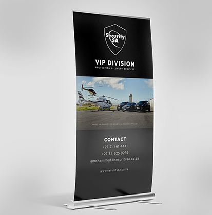
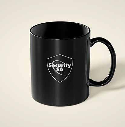
This identity was applied to a promotional video and a broader suite of marketing collateral, including corporate literature, large-format display material, branded merchandise and other supporting applications. Consistent art direction and brand placement ensured that every item formed part of a cohesive visual system.
The completed project established a refined and recognisable identity for Security SA’s VIP Division. The silver emblem gives the division its own premium presence, while its relationship with the primary Security SA brand remains immediately identifiable.
The resulting promotional video and marketing collateral provide Security SA with a consistent and versatile platform for presenting its VIP services across client engagements, events, digital communication and corporate environments.
